An Expert Approach to Color
The past couple of weeks, I’ve talked about how I approach my color palettes, how I mix my colors, and the wild history of color.
For my last color series post, I want to talk about how to approach color like an expert. I mentioned in my color palettes post that experts use as few colors as possible. While that’s definitely true, there’s more to it than that. In this article, I’m going to point out some tricks I’ve noticed experts doing, as well as provide examples of great work.
Show the Unexpected
Amateur artists paint things exactly as they believe they are. They will paint an apple red, an orange orange, and a banana yellow. Amateur artists paint what they know.
Intermediate artists are those who have learned to see. They’ve forgotten all about what they know. They can see that even when a banana is yellow, there are so many more hues present. There may be purple in the shadows, or color reflecting off the walls in the room. Even the light shining on the banana has a tone to it.
Expert artists have learned how to see, but also they know that a painting is more interesting when colors aren’t depicted exactly as they are. They know people want to see their take on something. They paint things how they wish they were, instead of how they actually are. Why can’t an apple be pink, or a banana be blue? They have a way of pulling the viewer into their own fantasy world with the way they use color.
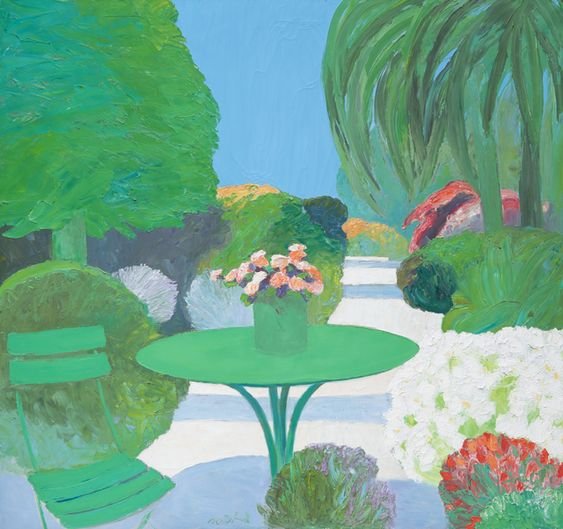
I’m pretty sure the vibrant greens and blues were not true to life in the painting seen below. However, that’s what makes the piece.
Jardin a Cannes by Roger Muhl (2000)
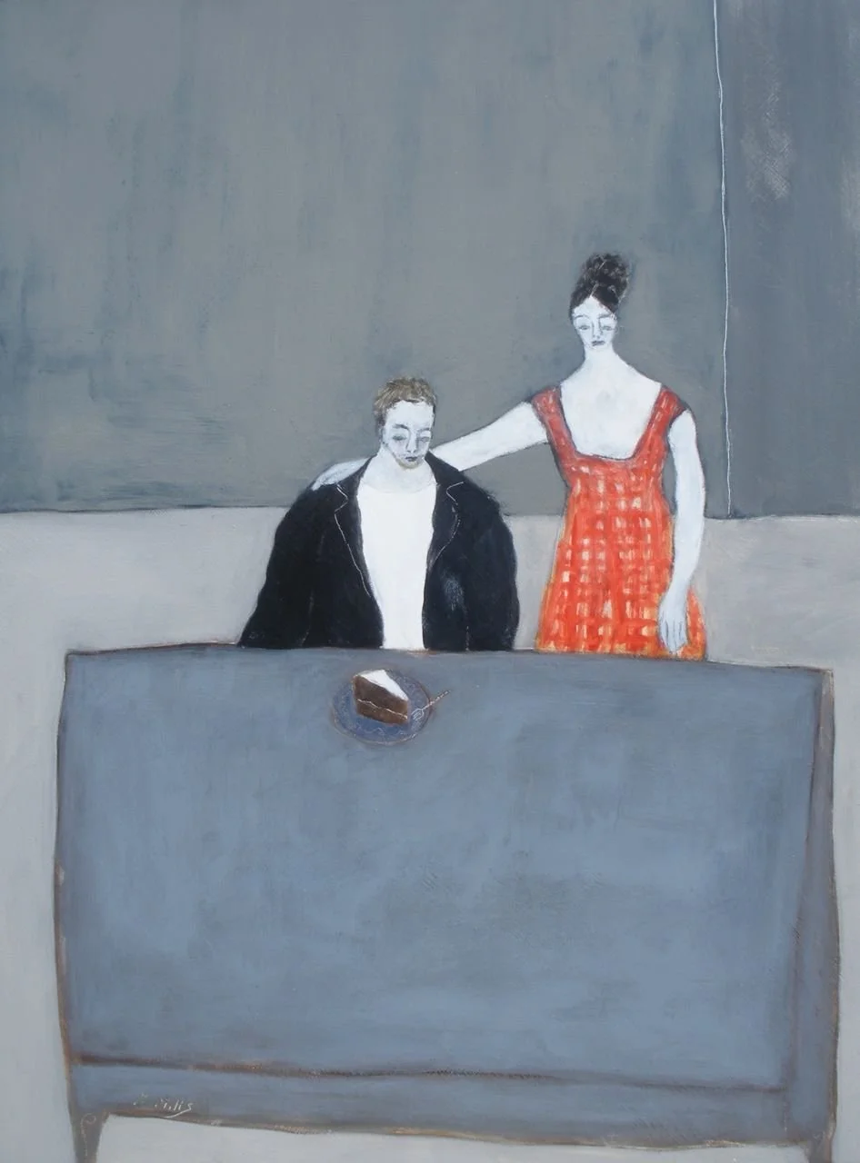
Praying on a Pink Pearl by Emily Isabella
I love the simple color tweaks in this little painting above. It’s so much more fun and interesting.
In the piece below, I’m sure these women didn’t have greenish skin and hair, but that’s what makes the painting interesting.
Fillettes se Promenant by Edouard Vuillard (1891)
Experts are Color Minimalists
I mentioned previously that less is more when it comes to color palettes. However, I never discussed why. Experts are choosy about what colors they use, because they know their color palettes are their calling card. It’s the easiest way to develop your own style and set your work apart from the pack. When I think of all my favorite artists, certain colors come to mind for each. Another bonus is that all your work looks cohesive and shows well as a group.
The colors each artist uses are based on preferences. They’ve taken the time to unearth what colors they like and don’t like. They know which colors feel most like them.
Experts also know that by keeping their color palette more minimalist, the work gets more interesting. Believe it or not, it’s more fun to have less choices as an artist. That is where the real magic happens.
The Gigi Mills paintings below all have the same color palette. These are pretty much the only colors she uses in her work.
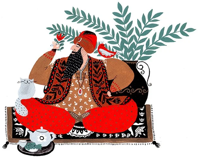
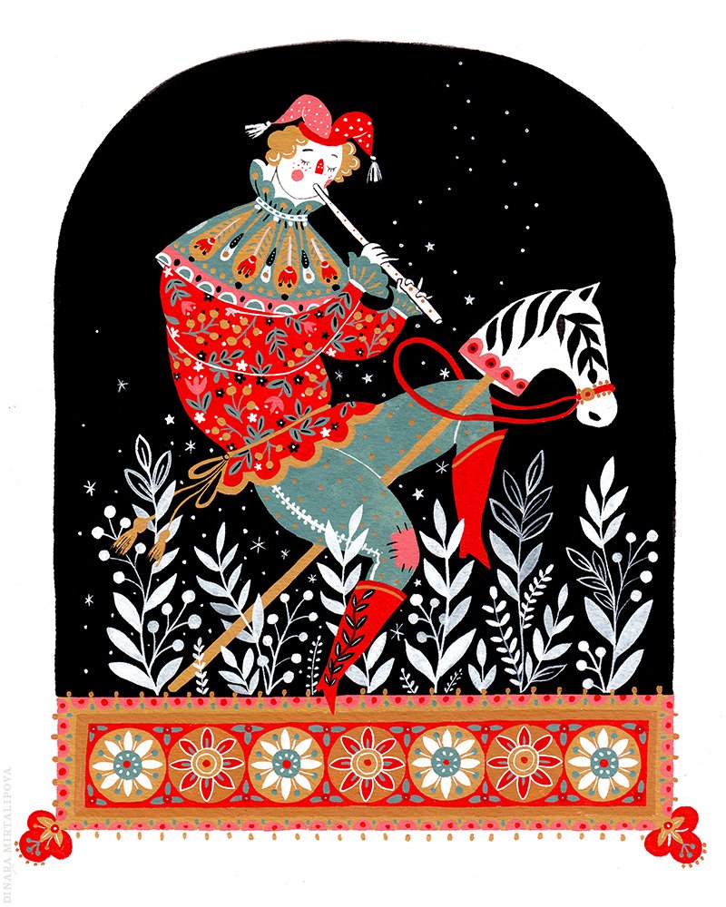
Illustrator Dinara Mirtalipova also uses the same colors over and over again in her work. Between her color palette and distinct folklore style, I’d recognize her art anywhere.
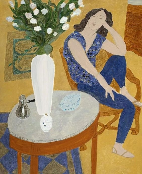
While Pierre Boncompain uses many different color palettes for his work, I’ve noticed many are repeated over and over again. This mustard, blue, and white color palette is one of his signatures.
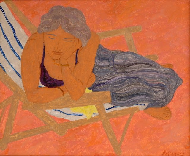
And so is this red, orange, and indigo palette…
Every Color Has a Meaning and a Mood
A painting isn’t just about what colors are pleasing to the eye. It’s about getting the viewer to feel something - whether it be nostalgia, sadness, joy, fear, or anger. When experts approach a painting, they first consider what mood they want to convey. They know the easiest way to convey a mood is with a specific color palette. Some artists are famous for conveying a similar mood in all of their paintings. Other artists like to mix it up.
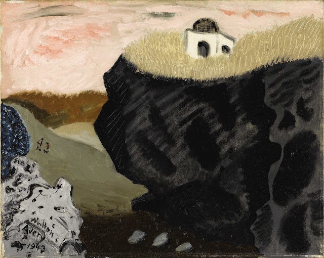
It’s hard to believe the two pieces below are by the same artist, Milton Avery. The emotions I feel looking at each are completely opposite.
Laguna Beach by Milton Avery (1943)
Sun Over Southern Lake by Milton Avery (1951)
These two Laura Carlin illustrations have a completely different mood as well, because of their opposite color palettes.
by Laura Carlin
by Laura Carlin
Color Directs Attention
When a viewer looks a piece, their eye travels a certain route throughout the painting. Experts use color to design exactly where this route travels. For instance, by adding a little splash of red to a portion of your painting, you’re saying “look over here - this is important.” You can also add a trail of colors throughout the painting to carry the viewer’s eye forward. Color is power.
The absence of color can draw attention too. In the piece below, my eye goes straight to the white duck, the subject of the painting.
Back Cover of Angélique by Roger Duvoisin (1960)
In the piece below, the pink curtains carry my eye throughout the painting. My eye starts in the front and moves to the curtains in the back.
Cover of Town & Country by Ludwig Bemelmans (1940)
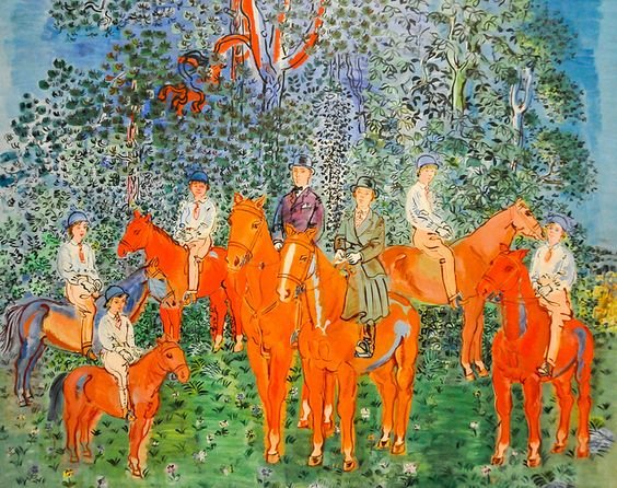
The Kessler Family on Horseback by Raoul Dufy (1942)
In the piece above, my eye goes to the horses, and then up to the little red branch in the trees. The red branch is a great way to guide the viewer’s eye through the rest of the painting.
The Lantern Parade by Thomas Cooper Gotch (1918)
In the painting above, the red lanterns guide the viewer through the piece. My eyes start in the back, and move forward, almost like I’m moving in the same direction as the parade.
In the End, Color is Simply Light
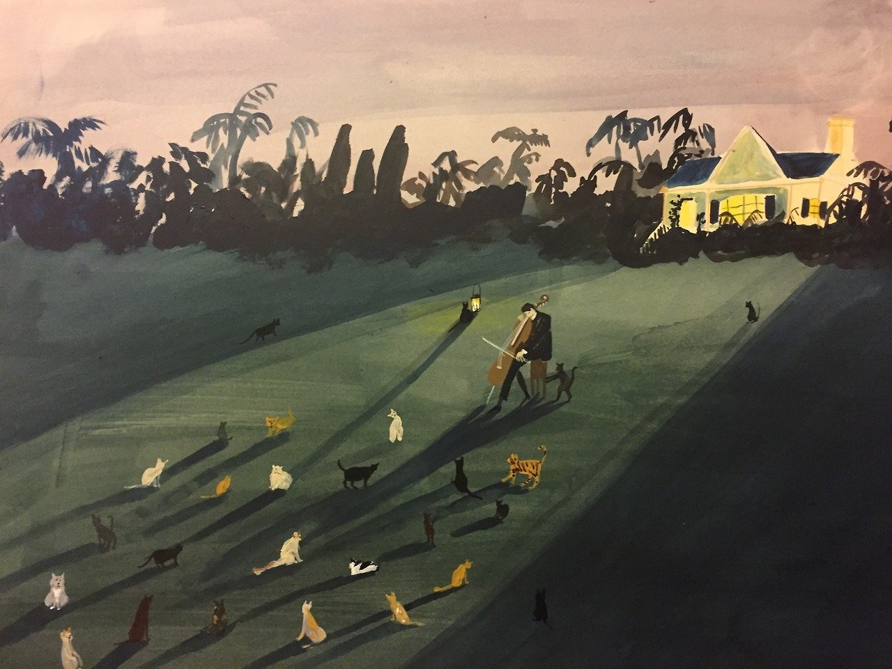
I often have to remind myself of this. Without light, there is no color. Hence, every painting has a light source that is illuminating the colors shown. Experts know how to manipulate lighting to work in sync with their color palettes. Some of my favorite paintings use light to strategically convey areas of color. Below are some great examples.
Christmas by Emil Robinson (2014)
Madeline’s Rescue by Ludwig Bemelmans (1951)
by Kirsten Sims
Above all, I’ve realized expert artists don’t fear color. They use it as a weapon. They aren’t afraid to push the boundaries and try new techniques. If you get your colors just right, hitting all the right notes, your art will sing. We all know that wondrous feeling of looking at a piece where the artist got the colors just right.













Thanks for stopping by! I’m an illustrator & writer. I’ve been running my own creative business since 2015. My mission is to help artists find their unique creative voice, build positive habits, and do what they love for a living.