
How to Edit Your Artwork to Create Quality Prints

A big thanks to Marisa S. for suggesting this week’s post. If you have a topic you’d like me to cover, just fill out the form at the end of the article and I will get to it as soon as I can!
When it comes to editing my paintings, I’m fortunate I’ve worked as a professional graphic designer for many years, otherwise I’m not sure I would have figured it out. I still don’t know how artists with a more traditional background learn how to edit their files. It’s not easy!! Today, I’m hoping to save you lots of time and pain by walking you through my process.
I’ve also included a tutorial video below, in case that’s helpful. Is more audio/video content something you’d like more of? Let me know in the comments!

What you’ll need
First off, all artists MUST have Photoshop. I realize it’s a serious investment, but there’s no way to digitize your artwork without it. You can definitely survive with just this one program. For just Photoshop, it’s $33.99 a month. Also, you can business expense the program, so you save money on taxes. The other program I use for my artwork is Illustrator, only because it makes versioning out print sizes easier. So, if you’re creating many print sizes, you may want to just bite the bullet and get Adobe Creative Suite for $79.99 a month. It you just need a couple of print sizes, or don’t mind the extra effort, stick with Photoshop only.
The second thing you’ll need is a computer to run your programs on :) This one is pretty obvious. I’m a bit old school here, preferring a desktop. A laptop is fine too, but the bigger the screen the better. You want to easily see imperfections in your work. I also prefer to use a mouse when editing my artwork. It just makes everything easier.
The third thing you’ll need is a scanner. You can also use a SLR camera, but I prefer the scanning method. Unless you’re a photographer, it’s just easier. Any old scanner will do. I use the scanner on my HP Laserjet. Just make sure the scanner scans at 600dpi or higher.
Set yourself up for success
There are a few things I learned the hard way to make editing your work easier:
Paint on a Bright White Paper
It’s okay to print on ivory paper, but it’s so much easer to have your original artwork be on white paper prior to the editing process.
Beware of Messy Mediums
We all love pencils and pastels, but smudges and shavings can make editing a nightmare. Paints, markers, and pens are much easier to work with. I love the look of raw pencil, but I keep it to a minimum for this reason.
Try to Get Things Right the First Time
Having the mindset of “no problem, I’ll just change everything in post,” is a great way to hate editing. Try to be as neat as you can while illustrating, fixing things as you create. The editing step is the last place you want to be making big changes. When you’re done with your work, make sure to erase sketch marks, and brush off any pencil or eraser debris.
Clean Your Scanner
I don’t know how it happens, but scanners get messy just sitting there. This makes editing more difficult. Every few scans, use windex to clean the glass on your scanner bed.
Make Sure Your Paper Lays Flat When Scanning
If I’m scanning my sketchbook, I have to put heavy objects on top to flatten it completely. If your paper is wavy, you may need to do this too. When the paper is not flat, your scan turns out blurry.
Step 1: Scan in Your Artwork at 600dpi
Below is a screen shot of the settings I use to scan my art on my flatbed scanner. 600 dpi is ideal, but 300 dpi minimum is a must. Unfortunately, 600 dpi does mean larger file sizes. However, it allows you to blow up your artwork and have it be crisp at any size. Because your artwork needs to be small enough to fit your scanner bed, I highly recommend 600 dpi if you want larger prints. I like to scan my artwork in as a TIFF.

Step 2: Open Your File in Photoshop
This step is pretty straightforward. If your file needs to be rotated, now is the time to do it.

Reminder - save your work! Choose a naming convention that works for you.
Step 3: Fill in White Areas
When you scan your artwork in, white backgrounds are not going to be pure white (even when using white paper). In order to combat this, start with the paint bucket tool. Set the paint bucket tool tolerance to 10-30 depending on how light your illustration is. Then, make sure your color is set to pure white (RGB 255.255.255/CMYK 0.0.0.0). Now click on the white areas to fill them in.
(Command+z) is undo in Photoshop, if your tolerance was set too high. You’ll know it was set too high if it turns light colored areas white.
The paint bucket tool won’t catch everything, so you’ll need to go in afterwards with the paintbrush tool. Make sure your paintbrush tool is set to pure white, and that the hardness on the edge is high. Fill in any dust or specks left on your background.
Once you’re done tackling dust and specks, trace the paintbrush tool around the border of your piece to make sure you got everything.


Reminder - save your work!
Step 4: Remove Imperfections on Colorful Areas
As with the white areas, there will be dust, specks and bubbles on the colorful areas of your piece. Here, you can use the clone stamp tool to cover up these imperfections.
The clone stamp tool basically grabs a copy of another area to cover something up. (ALT+click) on a perfect spot near the imperfection that’s the same color. Then (regular click) over the imperfection. If used properly, the imperfection will disappear! This tool takes some getting used to, but once you get the hang of it, it is THE BOMB.
You don’t want to overdo it on the corrections. That takes away from the charm of the piece. Just remove anything that distracts from your illustration.

Reminder - save your work!
Step 5: Adjust the Color Tones & Textures
In this step, I’m tackling two things - colors that aren’t quite right, or colors that aren’t applied thickly enough.
Click Select (in the toolbar at the top)> Color Range…
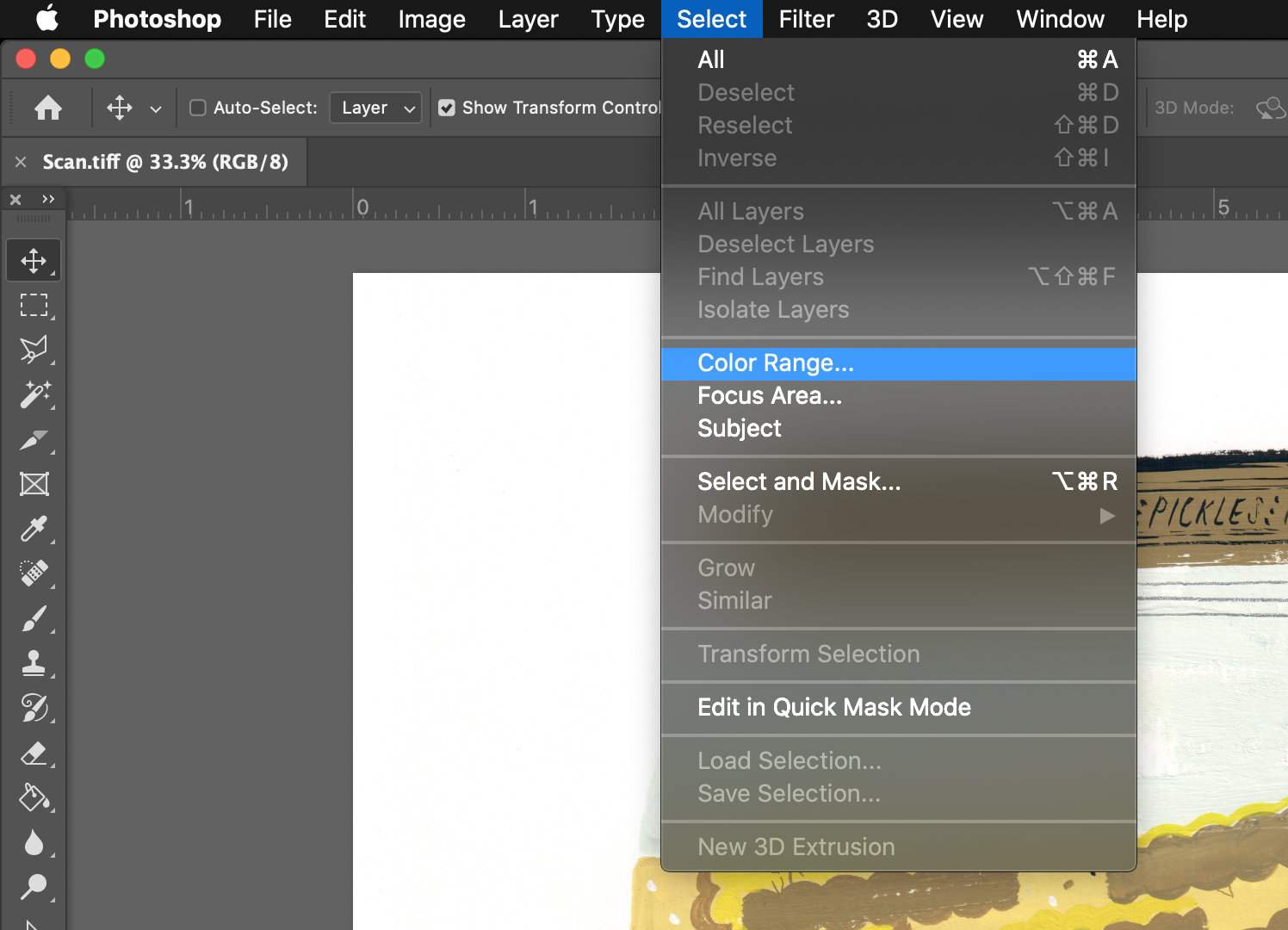
Now click on the color you want to adjust with the eye dropper. Adjust the slider in the Color Range box, until only that color is showing up in white. Click “OK.”

You’ll see a swatch of that color has now appeared at the bottom of your toolbar. Also, that color has a dotted line around it. Now create a new layer, and fill in that color with the paintbrush tool. I like to name the layer after what I’m selecting, such as “pickle juice.”
Now double click that layer. To make the color application look more smooth and thick, adjust the transparency. Usually, I end up around 70%.
To change the color, go to Color Overlay, and choose the color you want.
Step 6: Resize Your Print
Now go to Image (in the toolbar at the top)> Canvas Size…, and make sure your canvas is saved to the size of your print. This is the time to create any other print sizes you will need.
Now save your work, and you’re done!
I recommend using an app like Dropbox to store your artwork files, so you can rest easy knowing they are safe!


Bonus Step: Check Your Work
Now go back through and make sure you don’t need to repeat any of these steps. I like to really zoom in here and be meticulous.


Thanks for stopping by! I’m an illustrator & writer. I’ve been running my own creative business since 2015. My mission is to help artists find their unique creative voice, build positive habits, and do what they love for a living.