My Latest Woodland Portrait Series
Image © whatsontv.co/uk
I love the British BBC show “Fake or Fortune.” I get a lot of my inspiration from TV shows these days, come to think of it. My most recent illustration series was inspired by all the antique oil painted portraits I’ve seen on that show - specifically, those on the Cosway episode I recently watched. I have the portrait from that episode on the right. I won’t give anything away and tell you if it’s a Cosway or not :) I do highly recommend that all artists watch the show though.
Additionally, I was inspired by the animal photographs I’ve seen in many nurseries these days. I feel like a lot of those images are a bit tired, so I wanted to put my own spin on that concept. Examples of this type of art are below, but I’m sure you already knew what I was referring to. A lot of my pieces start with an art concept that I feel is overdone, and I reinvent it in my own style.
Image © EPHANY on Amazon.
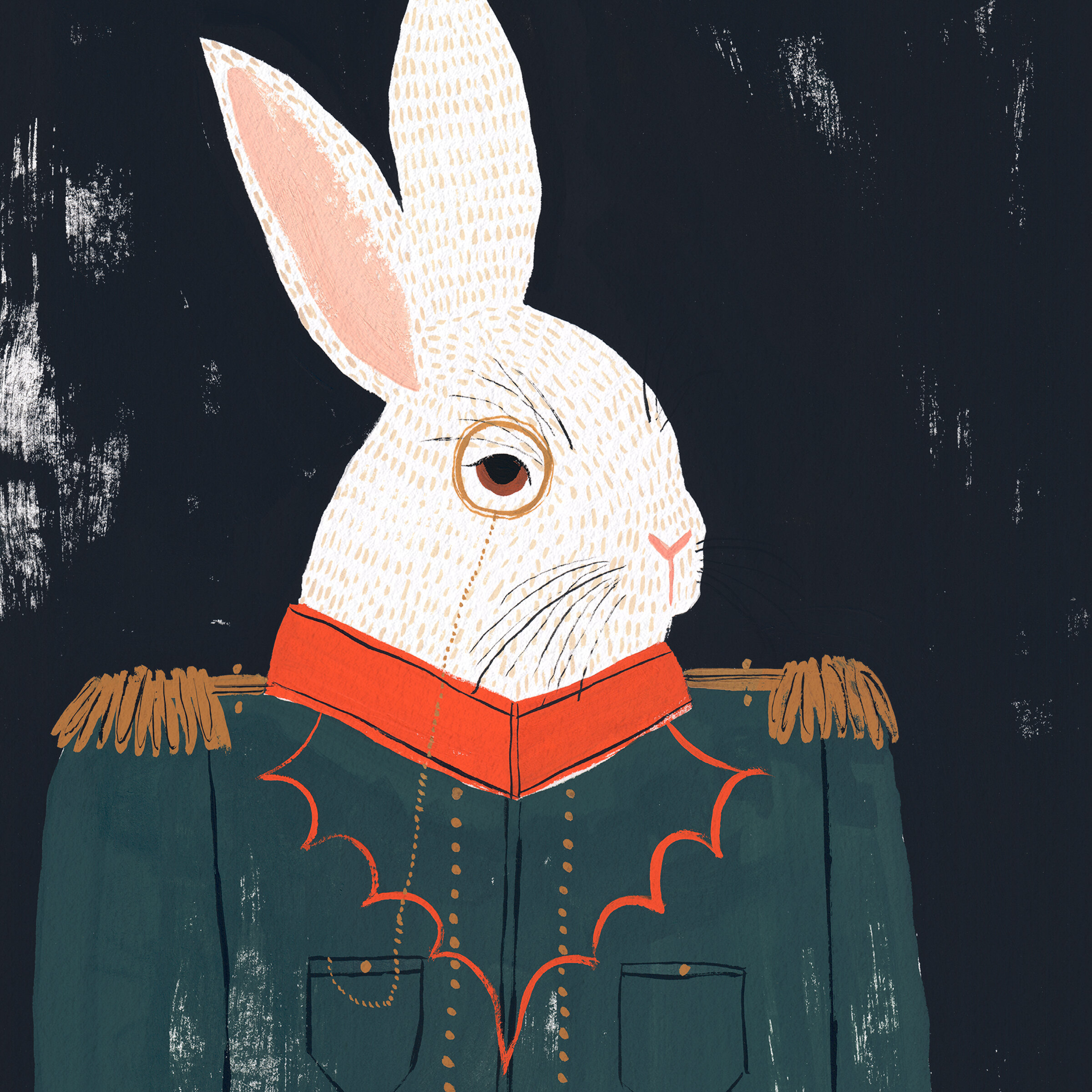
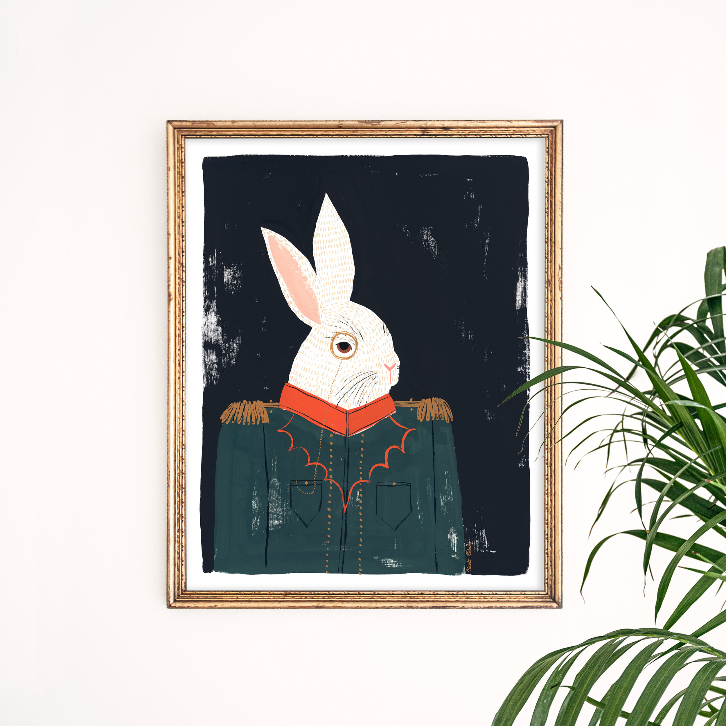
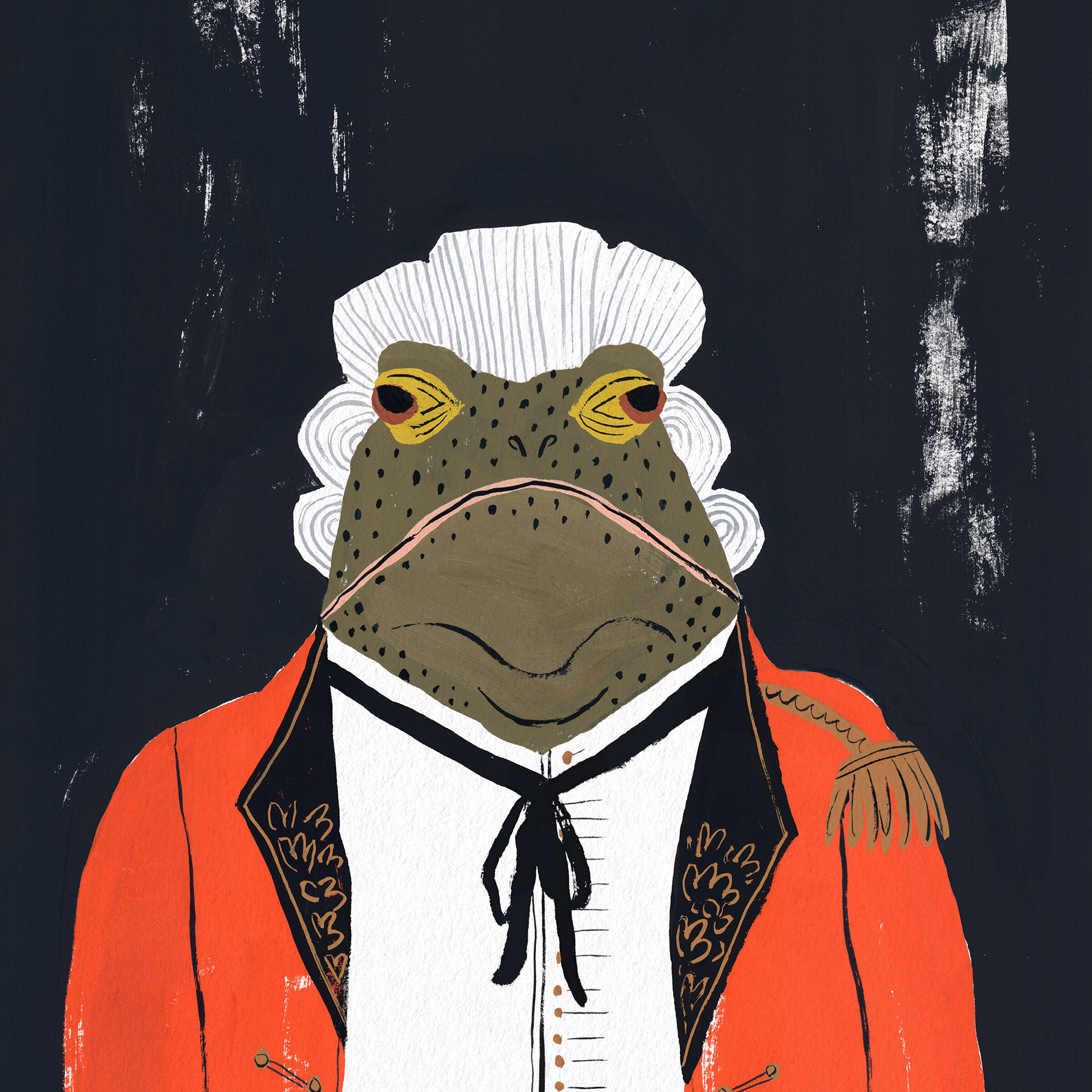
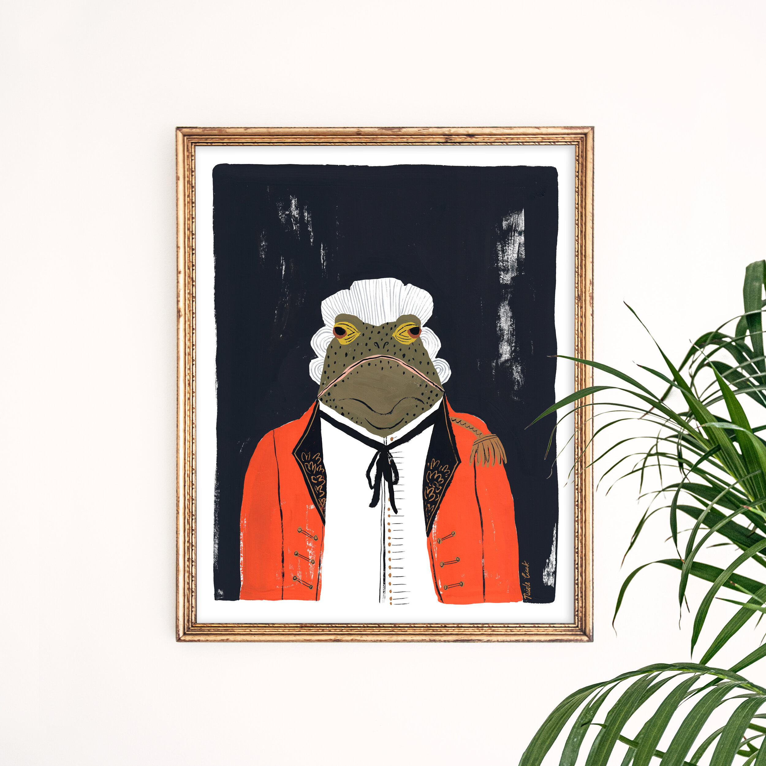
I wanted to create something unique, that had character, depth and texture. Below is what I came up with. I put a bit of a military spin on it, because I love a good military jacket. I also gave each animal a unique prop that I thought would fit their personality - a monocle for the bunny, a wig for the frog, and a hat for the fox.
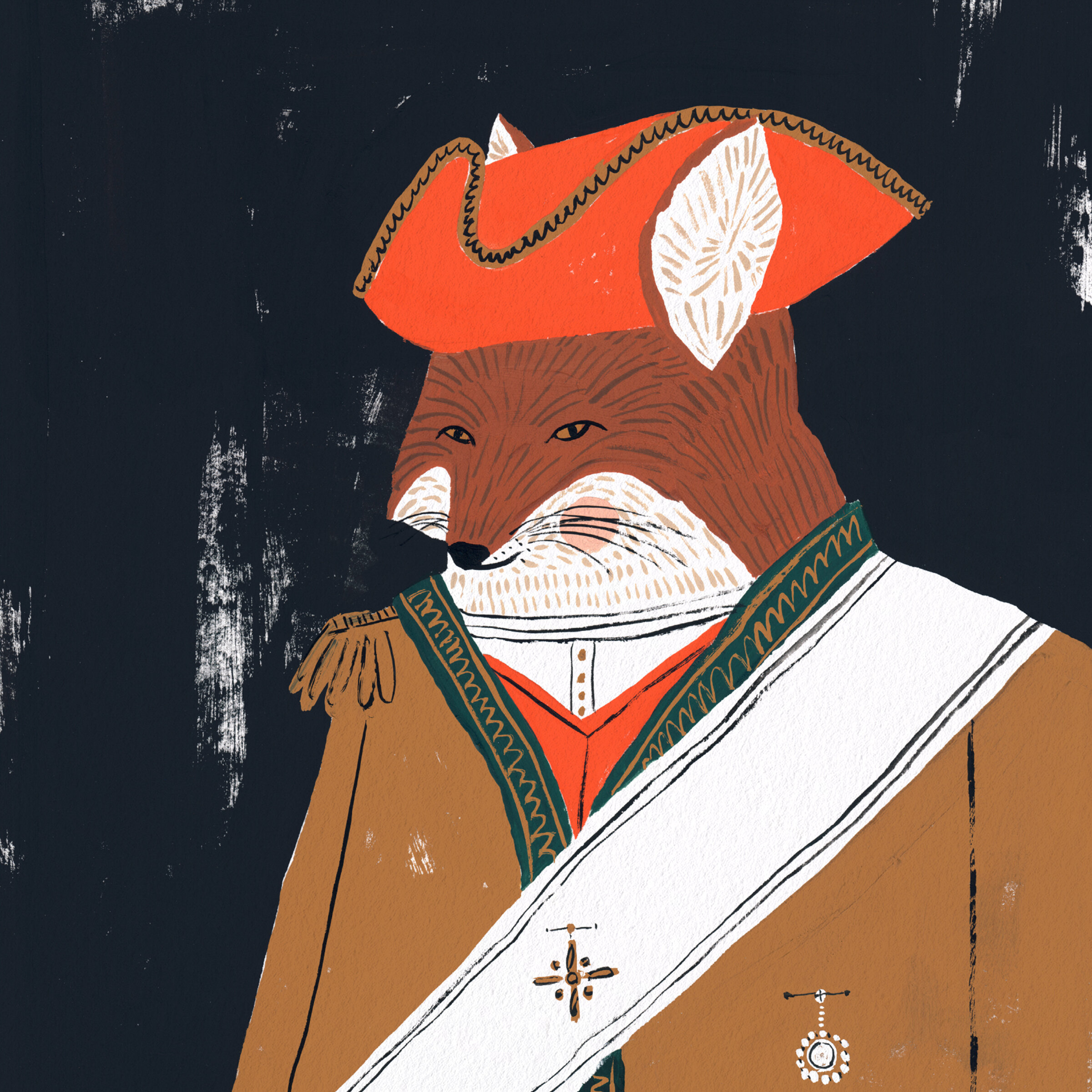
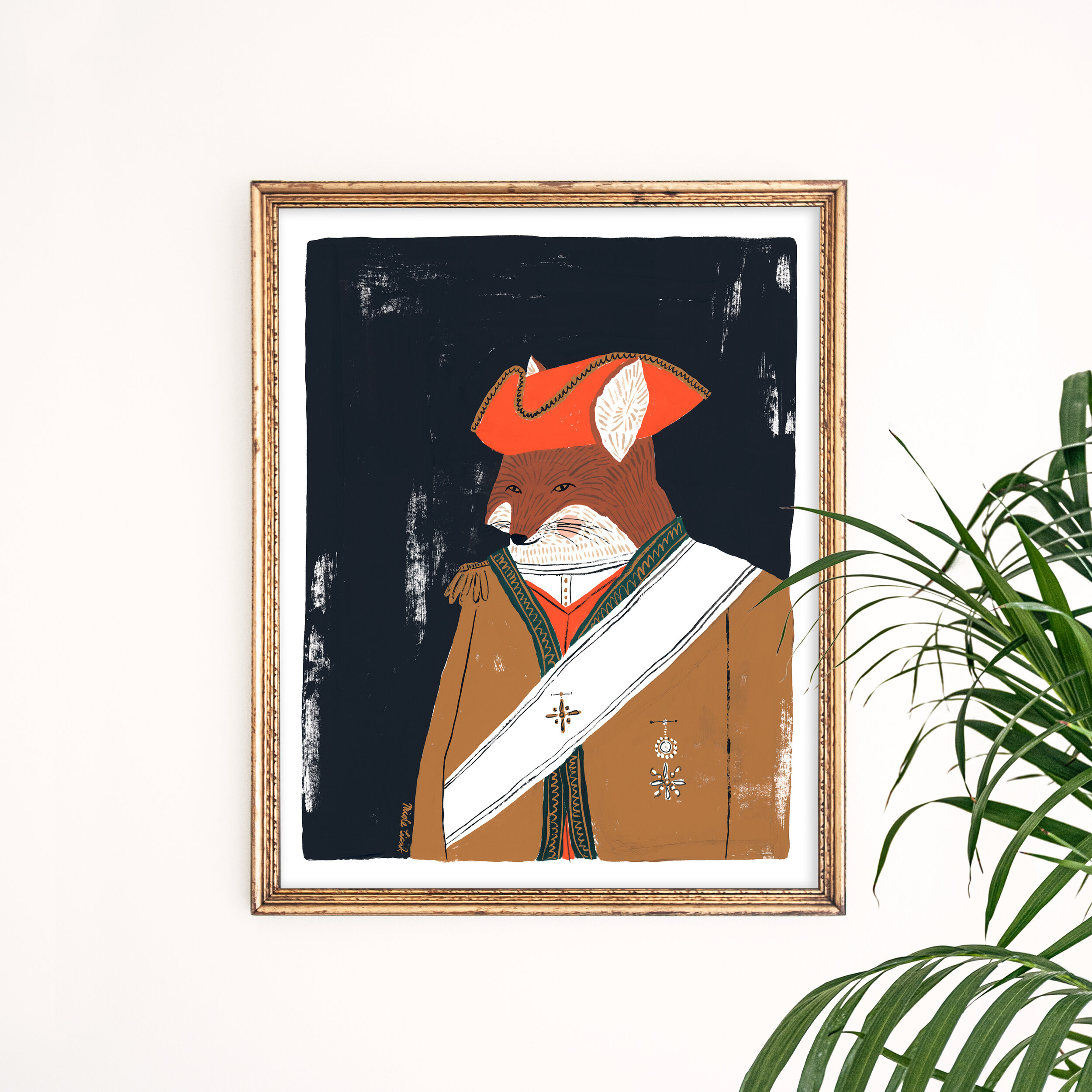
Every series I do, I always learn something new. It’s like a self-taught class.
Here is the first lesson I learned. The more I mature as an artist, I’m starting to use many different shades of black. Solid black just isn’t as appealing to me any more. Just last year, I loved a pure black background. Now, it seems to be too harsh. I guess its similar to paint colors - you never want a pure black or white shade. The shade should always compliment its surroundings.
The second realization I had is how much I love a dry brush technique. Solid blocks of color don’t really appeal to me anymore either. I love adding a bit of texture in areas, so you can see the paper through. It fun to intentionally use this texture to balance out elements in the painting. For instance, my fox portrait was fixed to the bottom right of the page. Therefore, I added a dry brushed texture to the top left of the portrait.
My third finding was more of a realization. Art puts you in so many different roles - costume designer, interior designer, pattern designer, etc. You are comprising your art of many different visually appealing elements and that go well together. I realized that’s why I like it so much. It takes all my passions and rolls them into one. I especially had to put my costume designer hat on for this one to make three costumes that go together, and look like they could exist in the same time period. I’m sure I wasn’t very historically accurate with my attire, but I think the costumes work to someone who’s not trained in British wardrobe :)
I have this set listed in my Etsy shop. It can be purchased here. I’m also selling them individually.


Thanks for stopping by! I’m an illustrator & writer. I’ve been running my own creative business since 2015. My mission is to help artists find their unique creative voice, build positive habits, and do what they love for a living.