
My Favorite Design Trends of 2020
We’re halfway through 2020, so I thought this would be a great time to discuss the design trends I’ve been loving this year. Funny enough, I’m not much of a trends person, so I have mixed feelings about writing this post.
I consider my style to be timeless and classic, always opting for vintage accessories and home decor that I could see myself sporting ten years from now. You may even notice that my illustrations have a vintage feel, and that’s intentional. I want them to withstand the test of time.
That being said, I don’t live in a bubble. As someone who makes a living from art and design, I still need to be aware of the trends that customers and clients are interested in. This year in particular, I’ve seen some really amazing trends that I could applaud all day long. In fact, if they never went away, that would be okay with me!
While I’m an illustrator & graphic designer, the following trends transcend all visual categories, including home decor and fashion. I’ll even give some examples of how you can apply them to your life. Alright, let’s kick this part off!
Green is Queen
As someone whose favorite color is green, I couldn’t be happier about this trend.
While I love so many shades of green, the world is mainly loving two - the first being Chartreuse. In the Etsy 2020 Trend Report, they said :
“Chartreuse is a bold color known for increasing energy, encouraging unconventional thinking, and evoking feelings of growth and harmony (and a nod to all of ‘80s the neons making a comeback right now).”
The second shade of green the world is loving is Olive Green. Dwell magazine says :
“Classic Blue may have been deemed Pantone’s color of the year, but we’re seeing dusty greens—from olive to pistachio—gaining traction in the home right now. These muted tones work as a palatable pop of color for those who generally stick to neutrals.”
I hear you Dwell! I actually use olive green as a neutral shade in my wardrobe, because it looks a lot better with my skin tones than gray. Funny fact - apparently olive trees are in right now as well, so take it to the next level and buy an olive tree for your olive green room.
While green is queen right now, I’m not hating Pantone’s Color of the Year “Classic Blue” either. I definitely prefer that shade over a navy. I plan on using all three of these colors in my upcoming work - maybe even in the same piece.
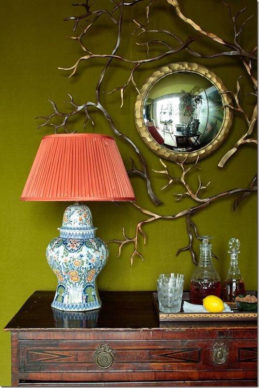
Photo Courtesy of Cote de Texas.

Photo Courtesy of The Fashion Spot.

Pattern is by Ashley G.

Photo Courtesy of Carnet Imaginaire. Illustration by Chloe Cheese.
Monochromatic & Color Blocking
While neutrals hold a special place in my heart, they’re taking a backseat this year. I say bravo! It may seem like monochromatic and color blocking are opposite trends, but they are both about bold, over-the-top color usage. Monochromatic is taking a bold color and getting crazy with it - I’m taking painting the walls AND the ceiling (and maybe even your furniture). I love this trend, and I think it’s brilliant. I love the idea of wearing one color from head to toe, or creating a painting using just one color.
Color blocking is defined in the dictionary as the use of contrasting blocks or panels of solid, typically bright color (in fashion and design) . It’s pairing large blocks of color together in a surprising, unexpected way. I love the idea of using this concept in my illustrations as well, similar to the example below.

Photo courtesy of Livingetc.

Photo courtesy of The English Room.

Antique art
Finally! This is my favorite trend, because I don’t really see it as a trend at all. I probably have 20+ antique paintings in my home because I adore antique art. It seems as if the rest of the world has finally gotten on board. Bonus points if you hang a vintage painting or two in your kitchen. This seems to be especially trendy right now.
The good news about this trend is that shopping antique is very sustainable. It’s much better for the environment than buying new, so it’s win win.
This trend makes me feel inspired to keep painting vintage subject matters. I love pulling inspiration from artists that have come before me, so it seems I should keep doing this. I would imagine now is a great time to buy vintage accessories too, because of this trend.

Image courtesy of Midwest Living. Photo by GREG SCHEIDEMANN.
Pattern Explosion
Bold, busy patterns are in - particularly wallpaper. I think this is a great thing to keep in mind if you’re an illustrator or designer. Go for the “more is more” approach when designing patterns. An especially trendy approach to this concept is to wallpaper a small space, like a bathroom. There really is no way to take this trend too far right now. Match your sofa to your walls, or put wallpaper on your ceiling. I’m loving this trend, because I love pattern design.
Bold tiles are in too, so this trend doesn’t stop at wallpaper. Although, I must admit I like the idea of using it for wallpaper better, since tile is more permanent.
A great way to make more complex patterns is to just paint larger. That way, when you shrink it down, it will be more detailed. This is something I intend to incorporate into my pattern design work.

Photo courtesy of @schumacher1889.

Photo courtesy of Snippet & Ink.
Natural Fibers & Textures
I love baskets, cane, fur, bamboo - any accessories with natural texture. Apparently this is right on trend at the moment. As someone who tends to shy away from color in my home (despite recent trends), I love using texture to add interest to a space. As far as the art scene goes, Dwell Magazine says:
”Fiber artists have been showing their work at fine-art galleries and fairs, but 2020 is the year you’re going to see this type of art—intricately woven tapestries, elaborately knotted macramé pieces—make its way into the home”
How do I plan to use this trend in my work? I could see myself showing my illustrations in bamboo frames. Or even playing with textured paints and gold foil in my work. I could even paint on a wood board (just brainstorming out loud here). I think this is a trend you can really have fun with. Maybe it will encourage you to think outside the box, and do something different in your work.

Photo courtesy of Selamat Designs.

Photo courtesy of Selamat Designs.
In general the one thing most of these trends seem to have in common is a trend towards Maximalism, or the “more is more” approach. Here’s what Real Homes as to say:
“It feels like the world of interiors has been dominated by minimalist Scandi design for, well, forever. But all signs are pointing towards a shift away from clean, bare interiors towards more flamboyant decor. We are talking plenty of pattern, all the bold colours and mismatched pieces of furniture. It’s a tricky look to get right so make sure you check out our guide to working the maximalist trend.”
I think this trend is especially interesting for anyone in the creative industry, because it’s encouraging us to go bold, be daring, and mix & match. We finally have permission to do whatever the heck we want! I intend to embrace this trend in my work and take more risks, and I encourage you all to do the same. There has never been a better or more interesting time to be an artist.


Thanks for stopping by! I’m an illustrator & writer. I’ve been running my own creative business since 2015. My mission is to help artists find their unique creative voice, build positive habits, and do what they love for a living.