
How to Create a Gallery Wall with Texture
One of the most common questions I get from customers is how to create a gallery wall with my prints. There are two types of gallery walls - symmetrical and asymmetrical. Symmetrical is easy. You just line up your frames in a grid-like fashion. It’s the asymmetrical gallery wall that’s tough, and that’s the type I want to talk about today.
I was recently asked to contribute to a Redfin article on 22 Unique Ways to Bring Texture into Your Apartment. My tip was to create a gallery wall that mixes modern and vintage frames of different sizes and colors. I also love blending matted and non-matted artwork. Varying the way your art is displayed will add interest to your space, giving it a more curated feel.
The biggest mistake people make when creating a gallery wall is thinking there are strict rules. That their frames need to match. That all artwork should be the same style or color. To me, the best gallery walls are those don’t follow the rules. I use a set a loose guidelines when creating gallery walls, but I’m always looking for ways to push these guidelines to the limit.
Frame Color
My rule of thumb is that there should be at least two of each frame color on your gallery wall. Similar colored frames should be placed on opposite sides of your gallery wall.
This is demonstrated below with the champagne and pretzel prints in black frames.

For how many colors (or finishes) of frames, I like to aim for three tones. Let’s say you go with gold, black, and wood. All the wood tones don’t need to match exactly, but they should be within the same ballpark. Same for gold tones.
When it comes to colors used in the artwork, I think anything is fair game. Just try to balance out the colors displayed. For example, if you have two paintings with pink tones, either place them far away from each other or right next to each other so it feels intentional.
In the example above, I’ve place the gumball machine and hot dog prints next to each other, because they have a similar color scheme.
Styles
As with the color of the artwork, I think any art style is fair game for a gallery wall. In fact, I love mixing modern and vintage styles. The same principles apply here - just try to create balance with your styles. Either put two paintings of a similar style right next to each other, or place them on opposite ends of the gallery wall.
Above, my balloon and champagne prints are a similar style, so I placed them far away from each other.
Matting
As I mentioned earlier, I like to stagger matted frames and not-matted frames throughout a gallery wall. It makes the wall more interesting. Matted artwork gives the gallery wall room to breath, because it creates white space amongst a sea of paintings. Matted frames should be dispersed equally throughout the gallery wall to create balance. And you should balance out matted frames with artwork that has white backgrounds.
As you can see in the example above, a lot my matted artwork is skirting the outside of my gallery wall.
Sizing
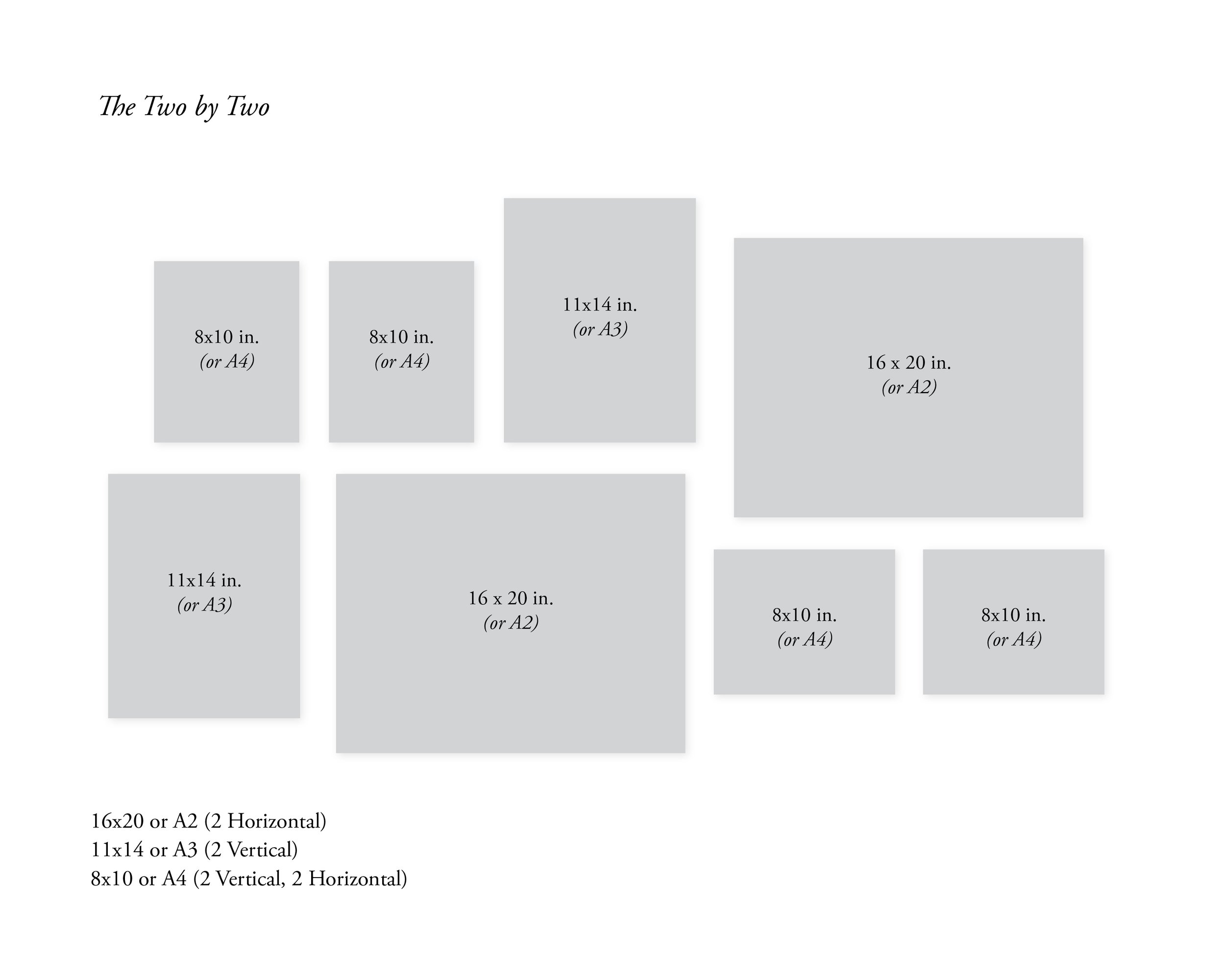
Now the tough part. My favorite gallery wall sizes to work with are 5x7, 8x10, 11x14, and 16x20. For international sizing, I’d go with A5. A4, A3 and A2. I usually don’t recommend going bigger than that, unless your wall is really large.
More often than not, I like to purchase artwork sizes in even numbers, because it makes the prints easier to balance out. When structuring the gallery wall, I usually start in the middle with two 16x20 prints, and work out from there. I disperse sizes evenly on both sides. In the example shown above, I have (4) 16x20 prints, (2) 11x14 prints, and (6) 8x10 prints. Two prints of a smaller size can be used to replace one print of a larger size, in order to add interest and not make your gallery wall perfectly symmetrical.
Spacing
Another tough thing to get right is spacing. You don’t want your prints too close together or too far apart. I usually aim for 1.5 to 3.5 inches (or 3.8-8.9 cm) between frames. If you have bigger frames, you can leave a little more space. Smaller frames require less space.
As far as alignment, it get’s tricky when you’re working with different sizes. I have two rules here. I will either align a frame with the edge of the frames around it, or I will center it with one of the frames near it.
The best way to get your spacing right is to lay out your frames on a blanket on the floor to figure out how you want to stagger them. It can help to have your friend or spouse hold up frames for you as you create your gallery wall, so you can make sure everything looks intentional.
Configurations
Now that I’ve gone over my basic principles for creating a gallery wall with texture, I’d like to show some example configurations to inspire your next gallery wall. As you can see in the examples below, I like to start with two larger prints (16x20 or A2) and build the rest of the wall out from there.


My most important guideline when creating a gallery wall is to loosen up and have fun. Too many people take this process too seriously. The beauty of a gallery wall is that it should feel hand curated. Little human errors are what make gallery walls charming.
Links to art prints shown in example (starting at the top from left to right):


Thanks for stopping by! I’m an illustrator & writer. I’ve been running my own creative business since 2015. My mission is to help artists find their unique creative voice, build positive habits, and do what they love for a living.